Unlocking evidence on cattle reproductive performance in sub-Saharan Africa
R. Jumah (AVCD FIPS ILRI)
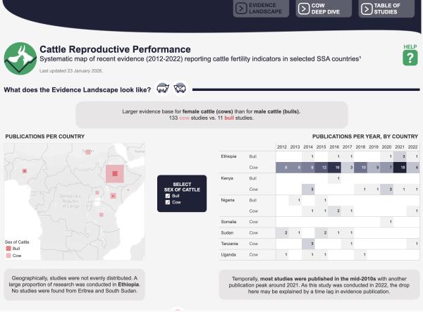
SEBI-Livestock has launched a prototype evidence synthesis dashboard that consolidates recent literature on cattle reproductive performance across nine sub-Saharan African countries.
The cattle reproductive performance dashboard is built for people who make decisions - policymakers, funders, researchers and practitioners - who often struggle to locate, compare and trust dispersed data. By systematically collating and harmonising fragmented reporting into an interactive format, we make it easy to see what the evidence says without sifting through dozens of articles.
Explore the data dashboard
How does it help, and who is it for?
The first challenge is that relevant evidence is scattered across many papers. Systematic evidence synthesis offers a rigorous, structured way to identify and compile what is known in a transparent, reproducible manner. The second challenge is that even when collated and published, the evidence can remain difficult to access and explore, especially for people who need to act on it.
By transforming a systematic map into an interactive, queryable tool, the dashboard reveals where evidence is strong, where it is thin, and how that should shape investment, policy and research priorities.
For policymakers and funders, the dashboard highlights where to prioritise resources, may inform national agricultural strategies, and supports evidence-based livestock programmes. Staff at international agencies and research institutes can use it to scan the landscape, identify gaps, and shape regional initiatives. For researchers and academics, it points to where primary data are lacking and where a systematic review may be feasible. For practitioners, it offers a benchmark for reported values in the literature, aiding planning and program design.
What does the dashboard offer?
Three tabs allow the user to move from overview to detail to sources:
- Evidence Landscape opens with a country map and a heat map showing where studies cluster and where gaps exist.
- Cow Deep Dive answers two common questions. First, which cow reproductive performance indicators are reported in the literature, and which are reported together? Second, what values are reported for each cow indicator, and how do they vary by country or publication year? Users can filter to the subset that matters to them and rapidly benchmark across the available time windows and geographies.
- The Table of Studies underpins every visual. Each article appears in a single row with key details (sex of cattle, country, author, publication year, title, journal, study type) and a link to the publication where available. This makes it easy to locate original findings and cite sources.
Thoughtful design for clarity and access
We prioritised design choices that make complex evidence easy to interpret and reuse.
To show which indicators appear together across studies, we have created a custom UpSet plot. For this data, a Venn diagram might typically be used. Venn diagrams however become unreadable beyond three or four sets, whereas UpSet plots scale cleanly and support quantitative analysis of multiple indicators. In practice, users can see how often individual indicators are reported and which combinations are co-reported, which is critical for synthesis and comparison.
Colour is meaningful and consistent throughout. Pink is used for visualising cow study metrics, coral for bull studies, navy for elements covering both sexes, and green for extracted indicator values. During design, accessibility was built in from the start. Colours were checked with a Colour Blindness Simulator, and each chart includes alternative text so screen reader users can comprehend the data and its message.
Small features lower the lift for busy users. Summary boxes capture key insights on each tab. Help buttons reveal overlays that explain how to read the visuals and use filters. Filters run across the dashboard, allowing focused exploration without losing the broader context. And the comprehensive table keeps the evidence trail transparent and auditable.
Building a suite of evidence dashboards
This prototype builds on SEBI-Livestock’s 2023 dashboard on livestock disease frequency and disease-associated mortality in Ethiopia. We have carried forward lessons learnt and continue to apply the FAIR principles (making data findable, accessible, interoperable and reusable) through consistent structures, reusable visuals and clear documentation. Source data are rarely “tidy” – an awareness that is helping us develop improved extraction templates and standards, enabling future dashboards to be built faster and extended more easily.
This approach is already informing new work, including an upcoming rapid review on foot-and-mouth disease (FMD), where insights here are helping to define how best to extract complex animal health parameters.
Currently, there are no data updates planned for this prototype dashboard. However, our goal is to build an extended suite of openly available standardised evidence synthesis dashboards that move findings from lengthy written text into a more interrogable format, and into the hands of people who need them.
Tell us what you need
We have developed this dashboard for decision-makers. If you use evidence to guide action, we would love to hear your feedback. What do you need to know to act with confidence? How do you use evidence synthesis products today, and how could the presentation be improved? Your insights will help shape the next generation of tools for livestock evidence in sub-Saharan Africa and beyond. Please email SEBI-Livestock with your suggestions.

